
Art happens when someone wants to do it. Advertising and propaganda start from given ends and work backward to means. — Peter Schjeldahl, “What are artists for,” The New Yorker, Dec 21, 2020
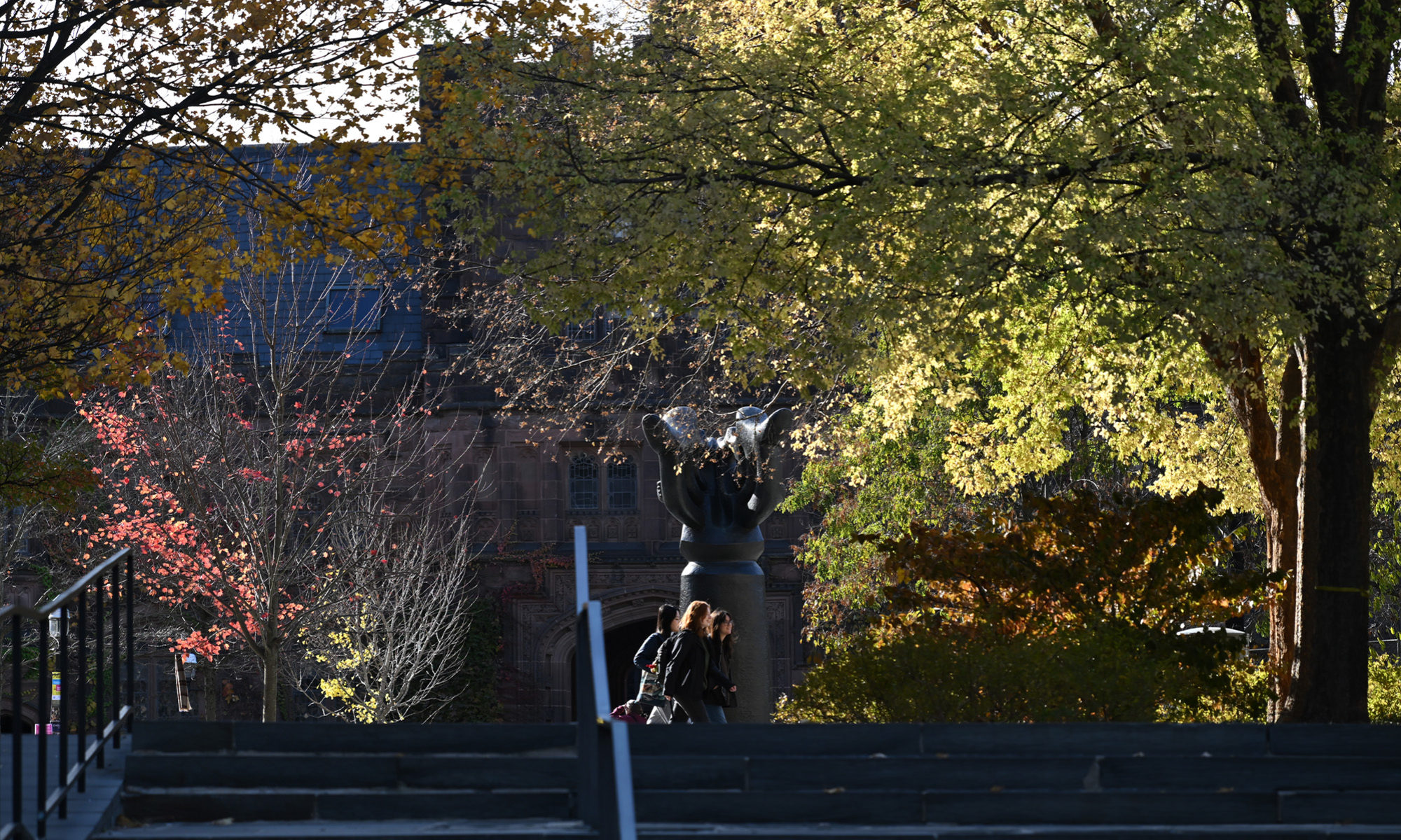
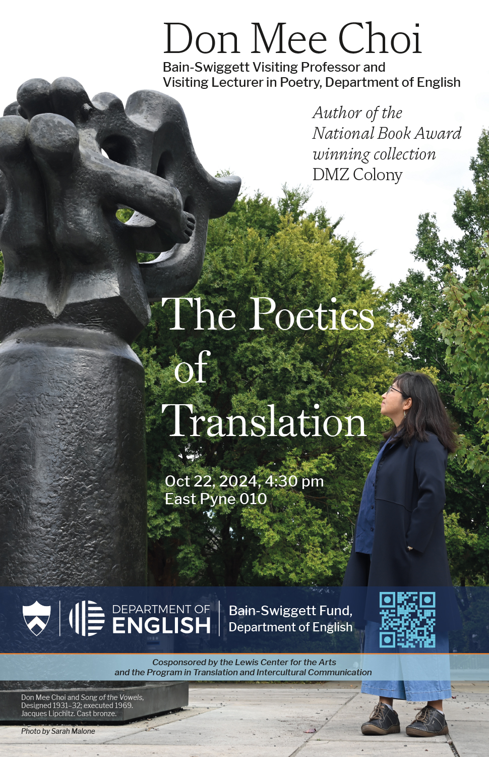
Upon seeing Don Mee Choi’s in situ photos, I thought about doing similarly to advertise her October 2024 Princeton English lecture with a photo of her in Princeton, since she was in residence here for the fall. She proposed a location: the sculpture Song of the Vowels on Firestone Plaza, a brief walk from our offices and the room where she taught that semester.
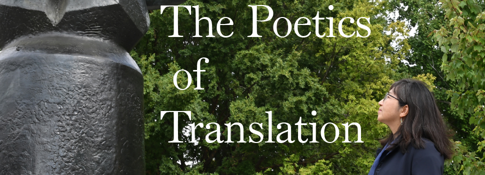
The trees along the plaza had grown their own way, not to be a backdrop for text:
As I selected, copied and pasted patches of leaves and darkness, softened their edges so as to leave no trace of insertion or replication, painted a little, too, I thought of the trompe l’oeil artists in Maylis de Kerangal’s novel Painting Time, their rapturous and tactile intimacy with their medium, their valorizing of craft, their role to achieve verisimilitude in realizing the concepts of others.
Here, for verisimilitude, patches of sky in the foliage retained intact are as essential as the filling of other patches is for the legibility of the given end worked backward from.
Is it art? With text laid over, the scene advertises a then-upcoming lecture, yes (the QR code pointing to its webpage remains live as of this writing). But things are not so reducible, I think. The poster captures a realization in progress of a desire occasioned by its given ends.
Another recent favorite poster was, unbeknownst to me while designing it, one of the last I would design before having Princeton’s 2024 visual brand guidelines to work and streamline my process within.
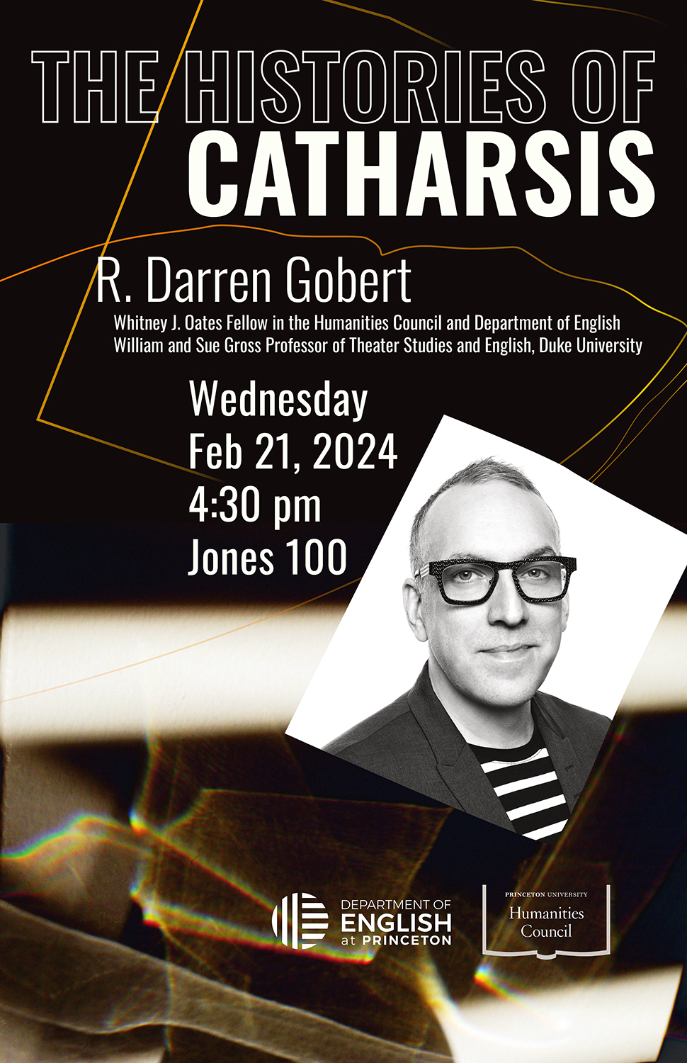
What visually conveys a concept? Here, beyond the speaker’s head shot, academic and lecture titles and the necessary details of where and when, I was left to my own devices, a welcome situation in this case, for I had elements to select from among that immediately seemed appropriate: a batch of photos I’d shot a few years before with no plan then how I might use them, but certain that the effect I’d happened to turn to and see was marvelous: the faceting of sunlight onto an afternoon wall through water in a crystal goblet that for some lost reason I happened to be holding. Moving goblet and camera, I’d cast and snapped photos of patterns of light that existed only as they were projected.
The irregular curved lines of the text framing are traced from facet edges.
For fun, and to test how the 2024 guidelines worked with a layout not designed around them, a year after the fact I returned to the Gobert poster’s Illustrator file:
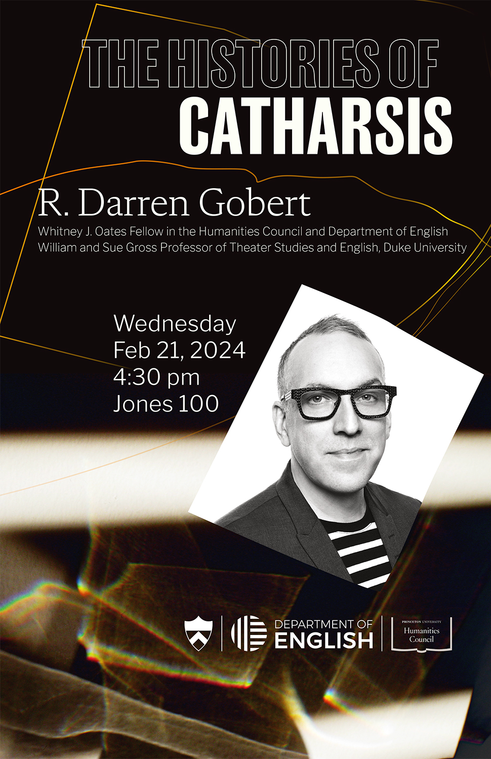
The logo “lockup” with the Princeton shield effectively frames foreground content, and allows for the removal of “at Princeton” from English’s logo for on-campus uses that works so well in Don Mee Choi’s poster, and here, too, I think.
QR code omitted. Shine on, facets.